Interior Design for Colour Blindness
Colour blindness is more common across the population than most people realise, and thoughtful design can make a big difference to those affected. It is estimated that approximately 8% of the world’s male population are impacted. Laura’s interior design for colour blindness offers a refined, thoughtful approach to creating spaces that are both beautiful and accessible. With a deep understanding of how colour is perceived differently, this bespoke experience ensures your home feels harmonious, balanced, and effortlessly stylish. It goes beyond specifying paint colours to selecting materials and finishes, crafting contrast and clarity, with every detail considered with care.
What is Colour Blindness?
Colour vision deficiency (CVD), commonly known as colour blindness, occurs when an individual perceives colours differently from many people and has difficulty distinguishing between certain hues.
It is a condition people are born with. While there is no treatment, diagnosis can be valuable, as it allows for practical adaptations to daily life. In interior design, understanding colour vision deficiency is particularly important, as well-designed spaces can support how individuals perceive, interpret, and interact with their surroundings.
Designing for colour blindness requires rethinking visual communication within the built environment. This approach goes beyond simply avoiding certain colour combinations, instead focusing on creating spaces where contrasting tactile qualities, visual patterns, and the relationships between colours work together to convey information, essentially performing the role that colour cues typically provide for people with standard colour vision.
*****
laura has a fantastic eye for design
“We asked Laura to help us create a colour palette for our house, and we couldn’t be happier with what she pulled together for us! We wanted to move past our very neutral colour scheme, but weren’t sure where to start and didn’t feel confident creating a cohesive look with warmer and bolder colours. Laura has a fantastic eye for design - with her guidance, we now have a gorgeous house colour palette which will bring so much warmth and personality to our home! Beyond great design, it’s been a pleasure working with Laura. She really took the time to listen and to understand our needs. She communicated with us regularly and always delivered each phase of the project on time (and often ahead of time!). She’s also generous with her time and expertise, providing lots of useful advice, such as recommending suppliers and tradespeople. We will definitely work with Laura again!”
— Caroline, Private Client in Surrey
Interior Design for Colour Blindness: A Tailored, Inclusive Approach
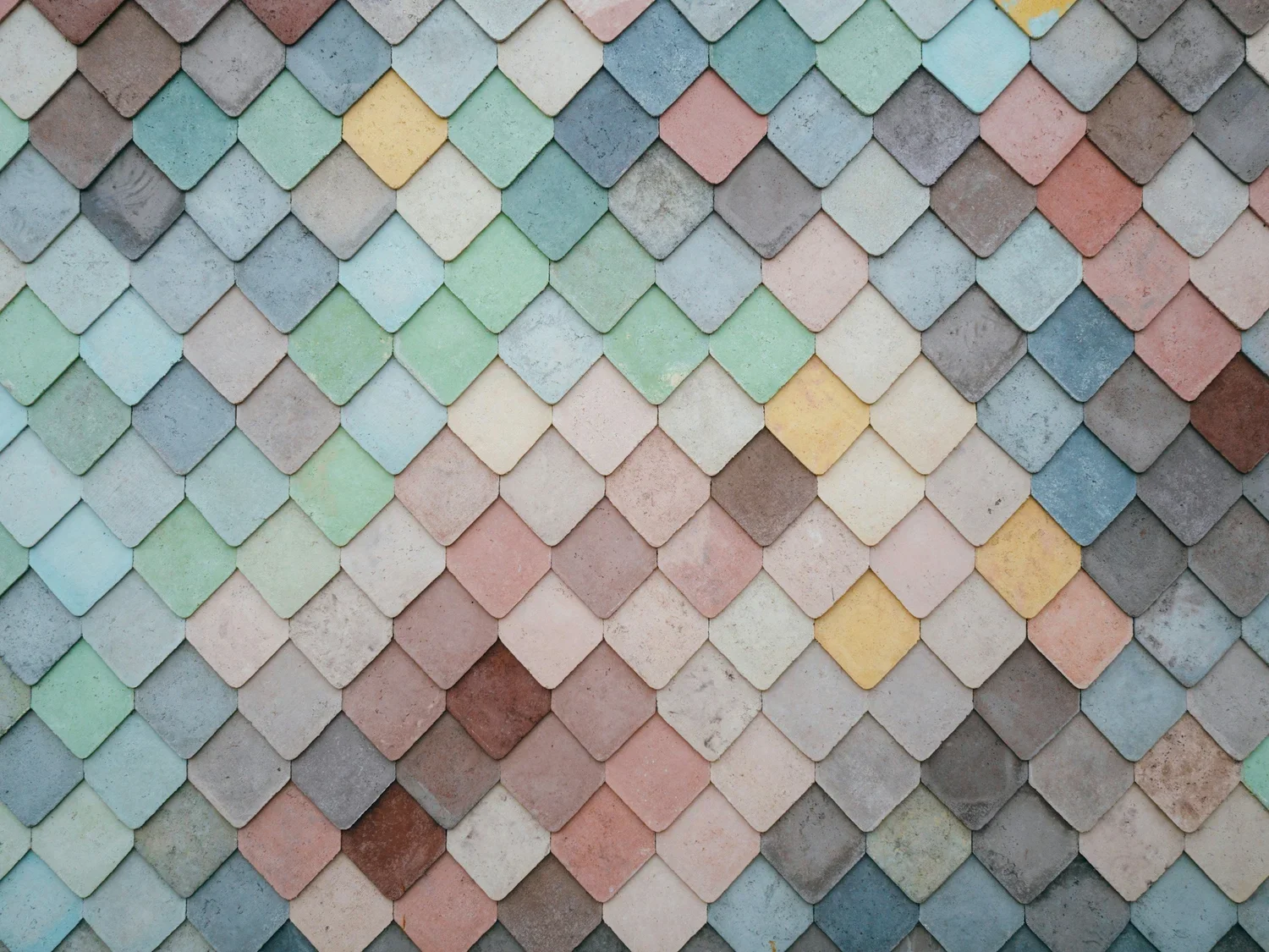
The Myth of ‘Safe’ Neutrals
Neutral palettes are often assumed to be universally accessible, but this isn’t always the case. For example, someone with red-blindness may struggle to distinguish between warm greys and muted pinks, colours that can appear nearly identical. The solution lies in curating contrast that’s perceptible without sacrificing calmness. Sample boards tested under varied lighting and colour vision simulation tools help reveal how the space is truly experienced.
Manufacturer Limitations
Many UK suppliers offer only basic colour data (like RGB or hex codes), omitting crucial information such as luminance contrast or surface reflectance. This makes it difficult to assess how materials will perform in real-world settings. A more refined approach involves building a curated materials library tested for CVD suitability and partnering with suppliers who provide detailed technical specifications.
Open-Plan Ambiguity
Open-plan layouts, while popular, can blur the boundaries between functional zones. Without architectural cues, navigation becomes less intuitive. To maintain openness while enhancing clarity, we use subtle spatial markers, area rugs, ceiling treatments, furniture placement, and lighting shifts to gently define each zone.
Existing Home Constraints
Fixed features like flooring or built-in joinery may not support visual accessibility. Large-scale renovations aren’t always feasible, but thoughtful interventions can make a difference: contrasting rugs, freestanding furniture in distinct tones, edge trims, and task lighting all help clarify spatial relationships.
What Matters Most in Interior Design for Colour Blindness
Interior design for colour blindness requires a considered, multi-sensory approach. Throughout the process, it’s essential to test every element using colour blindness simulation tools and to involve the client directly, allowing them to experience samples in situ under varied lighting conditions. This ensures that the design is not only visually legible but personally resonant. A walk-through of the entire home can help to evaluate the full journey, ensuring that every corner is thoughtfully addressed.
Functionality must lead the design conversation. Before aesthetics are considered, the space must work practically for those with colour vision differences. Clear spatial zoning is key, achieved through subtle shifts in flooring, lighting, and architectural detailing. Visual interest should be layered through texture, pattern, sheen, and form, creating richness that doesn’t rely solely on colour. Consistency is also vital; if a particular texture signifies softness and calm in one room, that visual language should carry through the rest of the home. Wherever possible, Laura will provide more than one cue, such as shape, position, or labels, so that colour is never the sole indicator of meaning or function.
Equally important are the elements to avoid. Red-green contrasts, while common in conventional schemes, are particularly problematic and should be excluded to prevent confusion. Monochromatic palettes without texture can feel visually fatiguing, while schemes composed entirely of subtle pastels often lack the necessary contrast. It’s a misconception that colour blindness equates to seeing in black and white, most individuals perceive colour, just differently from the average viewer.